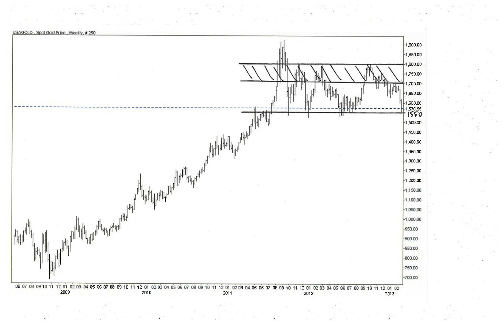
Anyway, above is a weekly chart that dates back to mid-2008. What you’ll notice is a distinct uptrend that moved along in a consistent and measured way through the first half of 2011. Then, in the summer, there is a huge spike up that coincides with the sovereign debt downgrade. After that euphoria, gold falls into a range with about $1,550 on the bottom (the level where the spike started) and $1,800 on the top. Had it not been for the spike to $1,900+, the pattern since mid-2011 would look more like a consolidation pattern and likely would not engender the same degree of angst from gold bulls and bears alike. Maybe I’m stubborn, but I continue to believe that the fundamentals underlying a long gold position remain in place. Chart be damned.
But, turning to the technicals, I think Faber is right about where the support will kick in. It has done it at that level several times already over the past 2 years. On the upside, the band between $1,700 and $1,800 is where the struggle will occur. Using those levels, therefore, is how I might craft a trade.